
Tags
book cover, composition, Cover Art, Cover design, design, golden ratio, illustration, John DeJordy, Keith Draws, Library, Transitions, typography
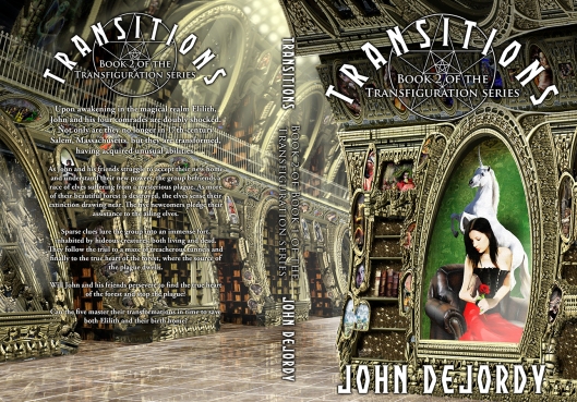
John gave me the following Brief:
Transitions cover art ©Keith Draws
“The setting is an elegant library with carved rosewood–as if the Sistine Chapel and a library crossed.
The focus, though, is on a painting hanging on the wall.
It is of a woman, wearing a beautiful, full-length gown as if going to a ball, and she is holding a deep-red rose. She has long, black hair and green eyes.
The portrait should have Diane sitting down, looking toward the spine of the book. Behind her, in the painting, a forest green (or some green that looks nice) tapestry with a unicorn (just enough to recognize it as such, if possible.
Diane has a slender nose and hypnotic eyes, and a wonderful smile. The smile is important. It doesn’t have to show teeth, just obviously a smile. She should be wearing a corset. The library, which I assume would be mostly on the back, would be of books and scrolls.”
To create the library I started with the amazing free “3D Mandelbulb Ray Tracer”.
It’s an amazing tool and it lets you create extraordinary images with a little patience.
I made multiple renders and edited them together to create the basic structure and then went on to add lots of details.
Inspiration can come from many places.
Johns Blog can be found here: http://johndejordy.com/
and his facebook: https://www.facebook.com/john.dejordy
